What makes a call to action actually work
Quick answerA call to action works when it names one clear action, tells the person what happens right after they click, and lowers the risk of clicking. Specific phrasing like "get my free quote" beats vague phrasing like "submit" because it removes the guesswork.
Every page, ad, and email ends the same way: you're asking someone to do something. Most owners spend real time on the headline and the photo, then type "Submit" or "Learn more" into the button without a second thought. That button is doing more work than it gets credit for.
A vague call to action doesn't fail loudly. It just quietly loses people who were ready to say yes. A specific one does the opposite: it tells someone exactly what happens if they click, and makes clicking feel like the easy choice.
Why "Submit" and "Learn more" lose
"Submit" describes what a form does, not what the person gets. "Learn more" doesn't say what they'll learn, or whether it's worth their time. Both are safe, both are common, and both give someone a reason to hesitate instead of a reason to act.
Think about the last form you filled out online. If the button just said "Submit," you probably paused for half a second to remember what you were actually agreeing to. That pause is where people leave.
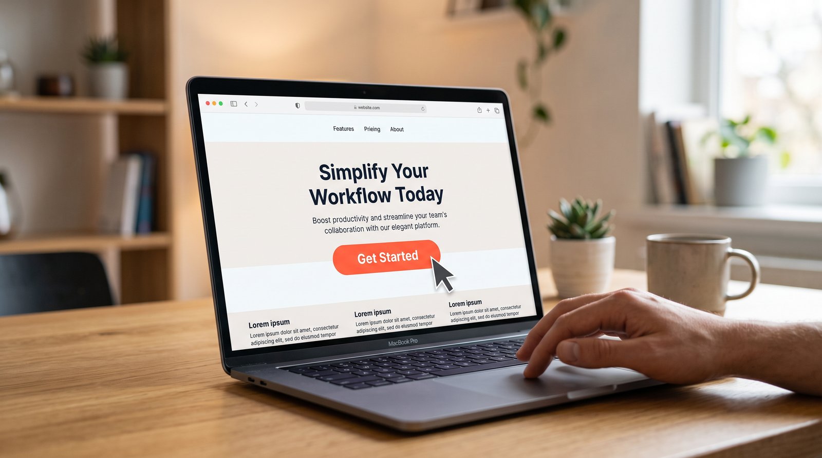
A specific button skips the pause. "Get my free quote" or "Book my appointment" tells you exactly what you're about to get, in your own words, before you click.
What a good call to action actually does
A strong CTA does three things at once, in as few words as possible.
- It names one clear action. Not "explore our services," but "see pricing" or "call now." One verb, one outcome.
- It says what happens next. After you click, do you land on a form, a phone call, a menu, a calendar? The best button copy hints at it so there's no surprise.
- It lowers the risk of clicking. Words like "free," "no obligation," or "same-week" tell someone this isn't a big commitment. It's a small, easy next step.
Notice none of this requires being clever. The best CTAs read like something a helpful person would actually say out loud, not marketing copy.
A useful test: could you say your button out loud to a neighbor and have it sound like a normal sentence? "Get my free quote" passes. "Initiate your consultation" does not.
Before and after: swipeable examples
Here's the same button, weak and strong, across the three places most local businesses use them, whether you're in OKC, Tulsa, or anywhere in between.
On a website: Weak: "Submit" Strong: "Get my free quote"
In a Google or Facebook ad: Weak: "Learn more" Strong: "Call for same-week service"
In an email: Weak: "Click here" Strong: "Book my spot before Friday"
On a contact form: Weak: "Send" Strong: "Send my message, I'll hear back within a day"
You'll notice a pattern. Every strong version answers the question a visitor is silently asking: what do I get, and what happens right after I click? Feel free to copy these directly and swap in your own service or timing.
Match the CTA to how ready someone is
Not every visitor is ready to buy the moment they land on your page, and one CTA can't do every job. Someone reading a blog post for the first time isn't in the same place as someone who just called for a quote.
Early in the visit, a lower-commitment CTA works better: "See our work" or "Check our pricing." Once someone has shown real interest, a direct CTA earns its place: "Get my free quote" or "Call now for same-week service."
Using the same generic button everywhere, no matter where someone is in the process, is one of the most common reasons a page with decent traffic still doesn't convert well.
Test it on your own site first
Before you touch anything else, open your website on your phone and find every button on it. Read each one out loud as if you were a stranger seeing it for the first time. Ask yourself what you'd expect to happen if you tapped it.
If the answer is "I'm not totally sure," that's the one to fix first. You don't need ten versions to test. Pick your highest-traffic page, rewrite that one button to be specific, and leave everything else alone for a couple of weeks. Small, clear changes like this are easy to make and easy to notice.
The honest part
A better button won't fix a page that isn't working for other reasons, and it won't turn a slow month around by itself. What it does is remove one small piece of friction that's easy to overlook and easy to fix.
Most owners write their own site and ad copy in a hurry, in between everything else running the business, and CTAs are usually the last thing anyone thinks about. If sitting down to fix every button on every page isn't realistic right now, it's a small, specific part of what we handle. See how we approach website copy, or if the whole site could use a fresh look alongside it, take a look at our website design process.
Frequently asked questions
What's an example of a good call to action?
Specific phrases work best: "get my free quote," "book my appointment," or "call for same-week service." Each one names one action and tells the person what they'll get, instead of a generic word like "submit" or "learn more."
Should every page use the same call to action?
No. A visitor reading a blog post for the first time isn't ready for the same ask as someone who already requested a quote. Lighter CTAs like "see our work" fit earlier in the visit, and direct ones like "get my free quote" fit once someone has shown real interest.
How do I know if my current CTA is weak?
Read the button out loud as if you were a stranger. If you can't say exactly what will happen after you click, or the wording sounds like something nobody would actually say, it's worth rewriting to something plainer and more specific.